Trends Our Designers Love
Trends Our Designers Love

-
Discover
-
Featured
The Internet has always (and continues to be) a trend. Today, it has advanced to the point where having a professional-looking website is one of the keys to designing success. Forms, factors, and functions are constantly changing, and successful website development is dependent on keeping up with the latest trends of those times.
Why You Should Consider the Latest Design Trends?
With more and more websites going online, maintaining a high level of visibility on the internet has become extremely difficult. Outdated and unappealing websites are a turnoff to visitors, even if the content is valuable. Having a non-compliant website will also harm your efforts to rank higher in search engines, making it harder for potential visitors to even find your site.
As design constraints and considerations shift, website developers must stay on top of the latest developments and trends to see how they can be used to improve website performance.
Check out some of our designers favorite trends for some inspiration on your next project!
DARK MODE & LIGHT MODE
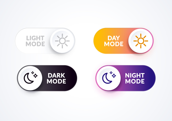
One of the growing trends becoming more available on mobile applications and devices is the the display options of Light or Dark Mode. Designers can now offer the options to view lighter text on a darker screen, which has been proven to help the eye in certain settings, in addition to saving battery life on smart phones. Some of the most popular applications that currently offer Light or Dark Mode for Android, iOS or both include:
- Word
- Slack
- Twitch
We suggest that businesses should be making Light or Dark Mode an option across all platforms. The current challenge for users is finding the option to switch to and from tedious. If designers can make a quicker way for users to change modes, this could become an even more common feature.
“We know people with an astigmatism have trouble seeing light stuff in dark situations, it creates flares. Sometimes it hurts, sometimes it helps. So, always give the opportunity to opt out and make that an easy switch.”

TRANSITIONS & MICRO INTERACTIONS [HOVER HERE]
No matter what age your user is, they will always appreciate animation on a website. Our designers love using transitions and micro interactions to motivate users within a website or app.
Micro interactions are those small, but highly motivating, moments that occur when the user and the design interact. Swiping, popup buttons, and scroll bars are all micro interactions that we as users see often. Transitions happen when a user is given an experience when moving between pages, such as a background change across the screen or fade outs.
They are both a way to navigate people through software, not just to make things attractive, but to motivate a goal. These animations elicit a dopamine rush, hold attention and focus, and satisfies users to finish the task. These interactions are a massive part of design, not just a trend, because they get users get a job or problem solved faster, which is the overall job of a designer.
ADVANCED CURSOR INTERACTION
A classic cursor is a thing of the past. Today, cursor type is crucial. Every click, every hover, every moment a user interacts with a cursor on a website should create an experience because they are following that arrow with their eyes at all times.
Our designers are big fans of advanced cursor interaction and believe it’s something that calls them to “take things off the screen and make it easier for the user and makes the interface less complex.”
There are many awesome websites that take advantage of cursor interaction. Canva’s WELCOME PAGE allows users to swipe over a blurry background with the cursor to uncover different design templates they offer. This gives the user control to see what interests them in a fun and different way than just a general welcome page would.
There are also some small cursor interactions throughout the EX SQUARED WEBSITE. Subject titles slide to a different color when the cursor hovers over them, in addition to buttons and changing colors when clicked on.
One of our favorite designers created an interaction experience for you to sample below:


IN BETWEEN STATES
The in between states of websites and apps are becoming more and more attentive to the user and less of just another tedious task. As said before, every single touch, tap, swipe, or click is an experience. Holding the attention of your users is a designers ultimate goal – don’t lose it, even in those in between moments.
Our designers love having the ability to change a user’s mood, even when they can’t find something they’re looking for. It’s these shifts and redirections that can keep a viewer in your app or on your site. Here’s a few that apply:
THE ONBOARDING EXPERIENCE
When a user opens your app or pulls up your website for the first time, what does that entail? How should it make them feel? Capturing their attention in the first is crucial. In fact, with the right onboarding, user retention rates have seen to increase by 50%.
AUTHENTICATION
It’s not just about passwords now. With face ID and touch ID, the login and buying experience make all the difference. Consider Apple Pay: When you double click to pay, there’s that little noise it makes and vibrates when successfully pay. That in itself is an enjoyable experience in between using an app and making a sale.
SERVICES ENHANCEMENT
How do you feel when you search something on a website and are handed a blank screen with the words, NO RESULTS? Well, that sucks.
Error pages are still an experience, but have come to be seen as a negative one. If a user doesn’t receive some kind of results or at least a redirection to guide them, they aren’t going to want to stay on your site or app. It’s time for designers to use this in between state to change the emotions in a way that makes them feel more positive. No more dead ends. Keep moving them forward.
READY TO GIVE THESE TRENDS A TRY? CONNECT WITH EX SQUARED TO PUT YOURSELF BACK IN THE RACES WITH A DESIGN TEAM THAT HAS THEM UNDER THEIR BELT. CONTACT US TODAY!
Talk with us
EX Squared is a creative technology agency that creates digital products for real human beings.
Talk with us
EX Squared is a creative technology agency that creates digital products for real human beings.


